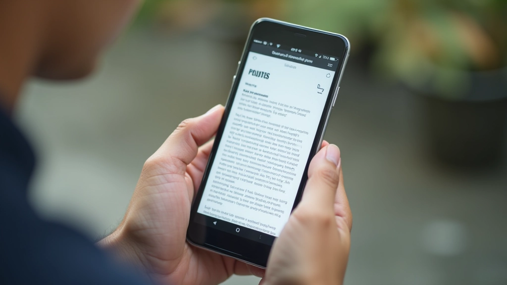
When someone’s reading your content on a packed jeepney during rush hour, you’ve got maybe 30 seconds to grab their attention. They’re not scrolling leisurely through paragraphs. They’re looking for one specific piece of information, and if they can’t find it in a glance, they’re gone.
That’s the reality of mobile-first design in the Philippines. It’s not about pretty layouts or clever animations. It’s about getting the job done fast. Scannable content isn’t just a nice-to-have — it’s essential when you’re designing for people with limited data, older phones, and precious little time.
Why Scannability Matters
- Most users won’t read every word
- They’re skimming, looking for key points
- Clear structure reduces cognitive load
- Quick scannable content = more engagement
Break Content Into Bite-Sized Chunks
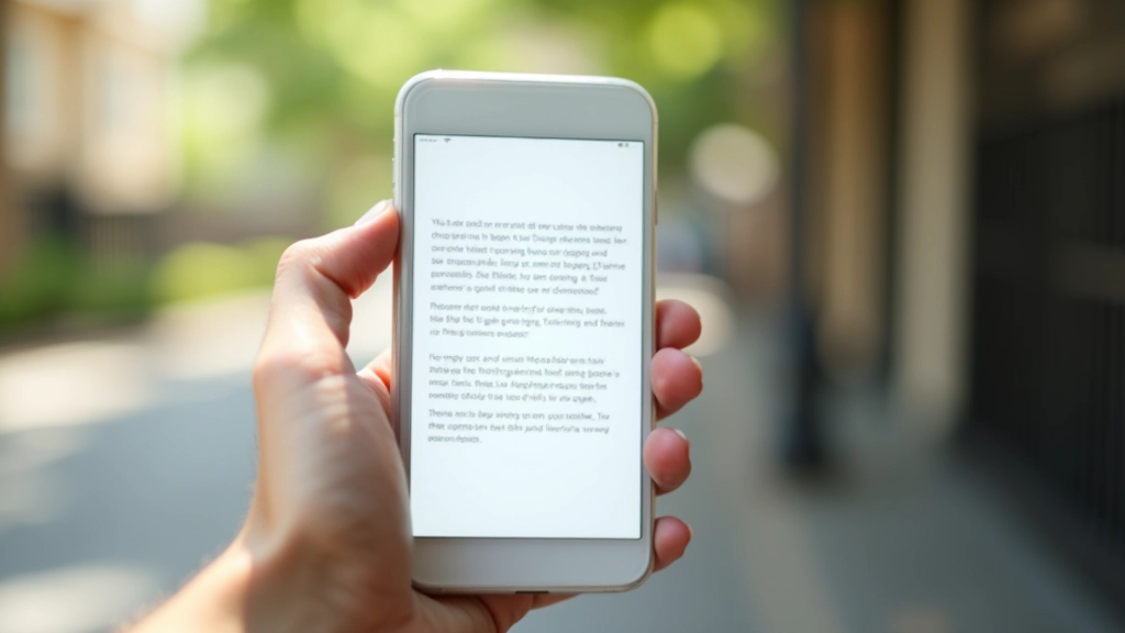
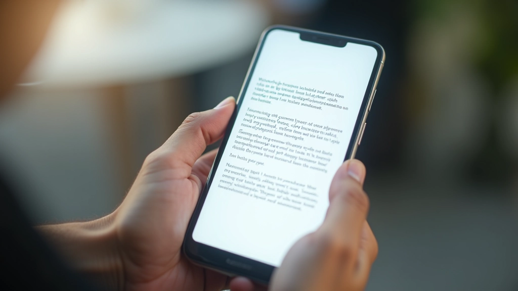
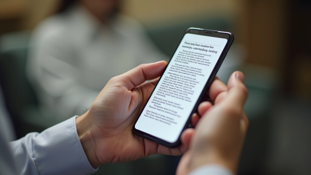
Long walls of text don’t work on mobile. Period. You’re competing with notifications, music, messages — everything demanding attention. If your content looks like an essay, users won’t bother.
Instead, use short paragraphs. We’re talking 2-3 sentences maximum. Some paragraphs can be just one line. This sounds sparse on desktop, but it’s exactly right for mobile reading. The white space actually helps users focus.
Think of each paragraph as a single idea. Once you’ve explained it, move to the next one. Don’t try to pack five related thoughts into one paragraph because you think it’s more efficient. It’s not — it’s exhausting to read on a small screen.

Use Headings Like Navigation
Your headings are a roadmap. Someone scanning the page should be able to understand your entire article just by reading the h2s and h3s. That’s not an exaggeration — it’s how people actually use content on mobile.
Make headings descriptive and specific. Don’t write “Benefits” when you could write “Why Scannability Reduces Load Times.” The specific heading tells readers immediately whether this section has what they need.
And actually use heading hierarchy. Don’t skip from h2 to h4. Use h3 for subsections. This helps with both readability and accessibility. Screen readers rely on proper heading structure, and so do users scanning visually.
Bold Key Terms, Not Entire Sentences
Bold text draws the eye. Use it strategically. When someone’s scanning, bold words become visual anchors that help them navigate.
But here’s the mistake most people make: they bold entire sentences. That’s too much. Bold a single term or short phrase that captures the key idea. Three to four bolded terms per paragraph is plenty. More than that and you’re just making the page noisy.
Right: “The key technique is using short paragraphs and strategic bold text.”
Wrong: ” The key technique is using short paragraphs and strategic bold text to guide readers through content effectively and improve overall readability. ”
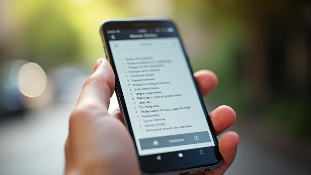
Lists Are Your Best Friend
Numbered lists, bullet points, checklists — they’re not just decoration. They’re scannable by nature. When you convert flowing text into a list, you’re making information instantly digestible.
Use numbered lists for steps or ranked items. Use bullets for related points without sequence. Use checklists when users might want to track progress. Each format has a purpose, and users recognize them instantly.
A list of 5 items takes seconds to scan. The same information in paragraph form takes minutes to read. That’s the difference scannability makes.
Visual Breaks Matter More Than You Think
Whitespace isn’t wasted space. It’s breathing room. On mobile, adequate spacing between sections makes content feel manageable instead of overwhelming.
Use generous margins between sections. Add space above and below headings. Let lists breathe. This might feel sparse on a desktop monitor, but on a phone screen at arm’s length, it’s perfect.
Images, dividers, and colored callout boxes also serve as visual breaks. They interrupt the text rhythm and signal that something new is starting. This helps with both comprehension and retention.
The Bottom Line
Scannable content isn’t dumbed down. It’s thoughtfully structured. You’re still providing complete information — you’re just organizing it in a way that respects how people actually read on mobile.
Your Filipino users aren’t sitting at desks with all day to read. They’re on jeepneys, in waiting rooms, between tasks. They want information fast. Short paragraphs, clear headings, strategic bold text, and plenty of whitespace — that’s not about being lazy. That’s about being respectful of their time and their data.
When you design for scannability, you’re not lowering standards. You’re raising them. You’re saying: “I respect your attention. I’ll make this as easy as possible to use.”
Disclaimer
This article provides general guidance on content structure and mobile design principles. Specific implementation should be tested with your target audience and adapted to your particular context. Results vary based on content type, audience, and device capabilities. For technical optimization, consult with your development team about your specific infrastructure and performance requirements.