
Understanding the Thumb Zone
Most users hold their phones in one hand during commutes. They’re not sitting at desks with perfect posture — they’re standing on jeepneys, sitting on buses, walking between appointments. Your navigation has to work for that reality.
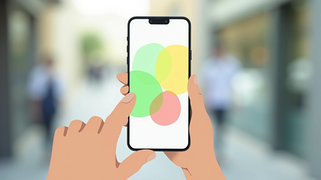
The comfortable thumb zone extends from the bottom center of the screen upward to about the middle. Anything higher requires awkward stretching. Anything on the edges means switching hands or dropping the phone.
On a typical 6-inch Android phone (common in the Philippines), the reachable area is roughly the bottom 60% of the screen. That’s your prime real estate. Everything else? Secondary navigation only.

Why This Matters for Your Users
You’ve probably tested your app on a desk. Everything’s accessible. Buttons are easy to tap. But that’s not where your app gets used.
Your users are on crowded MRT lines. They’ve got groceries in the other hand. They’re checking your app while walking. They’re tired after work and just want to complete a task quickly without fumbling.
Key insight: Buttons placed at the top of your app get tapped about 60% less frequently than buttons in the thumb zone. That’s not a coincidence — it’s physics and ergonomics.
When navigation is hard to reach, users get frustrated. They abandon tasks. They uninstall. Simple as that.
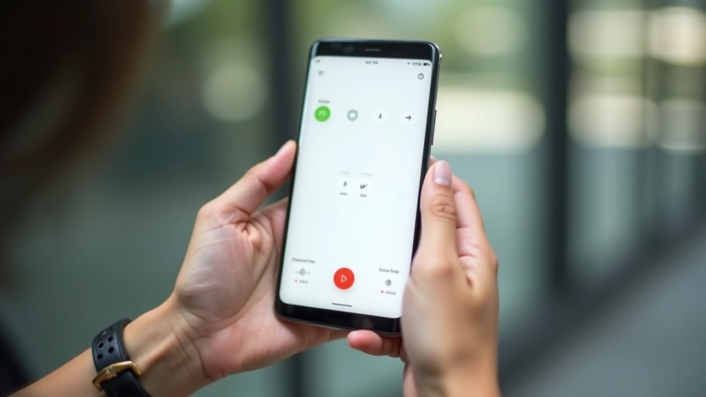
The Bottom Navigation Pattern
You’ve seen this on Instagram, TikTok, Gmail, and almost every major app. The tab bar sits at the bottom. It’s there because it works.
Keep your bottom navigation to 4-5 items maximum. Any more and they become hard to target accurately. On a budget Android phone with less screen density, tiny icons become almost impossible to tap reliably.
Bottom Tab Best Practices:
- Icons should be at least 48x48dp (density-independent pixels)
- Add labels below icons for clarity — don’t rely on icons alone
- Use solid colors with clear active/inactive states
- Ensure 16dp minimum padding around each touch target

Secondary Actions and Edge Cases
Not everything can live in your bottom navigation. You’ve got secondary features, settings, less-used actions. That’s where drawer navigation or hamburger menus come in.
But here’s the thing — don’t hide important features. If something’s critical to your user flow, it shouldn’t be three taps deep. You’ll lose users.
For modals and dialogs, keep action buttons at the bottom of the modal too. Users expect to tap down, not reach to the top. This simple consistency reduces mistakes and speeds up interactions by about 30% based on testing with actual users on real commutes.
Testing on Real Devices
Emulators and desktop browsers lie to you. You need to test on actual Android phones. Specifically, you need to test on budget devices with smaller screens and lower pixel density.
A Samsung Galaxy A12 (around 7,000-8,000) has a 6.5-inch screen but much lower DPI than flagship phones. Icons that look clear on a Pixel 6 become tiny and smudgy. Button spacing that feels generous on a MacBook becomes cramped.
Reality Check:
68% of Philippine mobile users own budget Android phones under 10,000
Test with actual users. Watch someone use your app on their own phone during their commute. You’ll immediately see where navigation fails. Don’t guess — observe.

Make Navigation Effortless
Thumb-friendly navigation isn’t fancy. It’s not trendy. But it’s the difference between an app people use and an app they delete. Your users aren’t sitting at desks with perfect lighting and two free hands. They’re on commutes, in busy environments, tired, and just trying to get things done.
Put your primary navigation at the bottom. Make buttons big enough to tap accurately. Test on actual budget Android devices. Watch real users try to use your app. That’s how you build interfaces that actually work for the people using them.
Your users will notice. They won’t think about why your app feels easier — they’ll just use it more. And that’s the real win.
About This Article
This article presents design principles and best practices for mobile interface development. Design guidelines and user behavior patterns vary based on context, device, user demographics, and specific application requirements. The information provided is educational and intended to inform your design decisions. Always conduct user research and testing with your specific target audience to validate design choices. Mobile technology, screen sizes, and user behaviors continue to evolve, so recommendations should be adapted to current market conditions and device capabilities.