Mobile-First Design for Filipinos
We’re ThumbFlow Mobile Ltd, and we’ve spent years perfecting interfaces for the way people actually use their phones. One-handed. On the go. With limited data.

Why We Started
Back in 2019, we noticed something. Thousands of Filipino users were struggling with websites designed in San Francisco. Sites that assumed fast networks. Sites that needed both hands. Sites that didn’t care about data limits. We couldn’t ignore that gap. So we built ThumbFlow Mobile Ltd around a simple truth: mobile design in the Philippines isn’t like mobile design anywhere else. Variable networks. Affordable Android devices. Commute browsing. These aren’t edge cases — they’re the norm. We’ve spent years learning how people actually interact with phones here, and it’s changed everything about how we design.
How We Design Differently
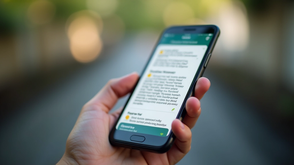
Every design decision we make starts with constraints. Not limitations — constraints. They’re the starting point for real innovation. We design for 3G networks and older Android devices first. We measure everything in kilobytes, not megabytes. We map thumb zones carefully. Every tap zone is positioned for one-handed use. Navigation doesn’t require reaching across the screen. Content breaks into scannable chunks. Because people aren’t sitting down to read — they’re reading between stops, during breaks, while holding a coffee in the other hand. This isn’t compromise. It’s how the best design works. You start with the hardest case and everything else becomes easier.
Our Core Principles
Android-First
We design for affordable Android devices from the ground up. Not as an afterthought. Not with workarounds. Affordable Android devices are what most people use here. We respect that reality.
Speed Over Everything
Every image compressed. Every script optimized. Every request counted. We’ve seen what happens when a page takes 10 seconds to load on a 3G connection. Our designs load fast on any network.
Thumb-Friendly Always
Navigation lives in reachable zones. Tap targets are 48px minimum. We design for one-handed use because that’s how most people browse during their commute.
Scannable Content
Short paragraphs. Clear headings. Bulleted information. People aren’t reading — they’re scanning. We structure content so they find what they need in seconds.
Data-Conscious Design
Images optimized ruthlessly. Video avoided unless essential. We assume users are watching their data limits. We’ve seen mobile bills that hurt.
Tested Locally
We don’t guess about performance. We test on actual devices. Actual networks. In actual conditions. That’s the only way to know if something really works.
Real Results
We measure success the way users experience it — not in design awards, but in actual performance and user satisfaction.
What We Commit To
ThumbFlow Mobile Ltd doesn’t just build interfaces. We build bridges between global best practices and local realities. Here’s what that means for every project.
Important Information
The information presented on this website is intended for educational and informational purposes only. Our expertise in mobile-first design, Android optimization, and performance techniques reflects our professional experience and testing methodologies. However, results vary based on individual circumstances, existing infrastructure, specific device configurations, and network conditions. We recommend consulting with our team to discuss your unique requirements and realistic expectations for your particular project. Success stories shared represent real client experiences but may not reflect typical outcomes for all projects.